
Have a look around a few websites. Chances are that you’ll see at least a couple of “Learn more” links. While CTA links like “Learn more” are found all over websites and within apps, they don’t bolster the user experience.
CTA stands for call-to-action and refers to the prompt for users to take an action. It can be a button, a hyperlink, or even an image but the text generally denotes the action you want a user to take.
When you looked at the websites, perhaps you also saw “Read more”, “Click here”, or “More info”. These are CTA links cut of the same cloth—they’re non-descriptive or general CTAs. They are very broad and act as a kitchen sink of sorts when it comes to links.
There could be many reasons why “learn more” has become so ubiquitous. Maybe the content team is understaffed (as is often the case) and doesn’t have the time or resources to dedicate to writing descriptive CTAs. Or maybe some of the copy was written by non-writers such as developers or SMEs (subject matter experts) who aren’t sure what to write so they use one of those CTAs as a catch-all. Perhaps it’s mobile-driven as Nielsen Norman Group suggests. Whatever the reason, it’s clear that non-descriptive CTAs are pretty common these days.
“Learn more” could arguably work in any scenario as they do the job of moving the user to the next screen or page. Simply put, “learn more” is a quick and easy CTA. But as UX writers, you can craft CTAs that are more effective and provide a better user experience.
On the Royal Bank of Canada’s website in the screenshot below, there are “Learn more” CTAs for both sections. Revisions for more descriptive links that set up the appropriate context might include “Visit Careers” and “See our impact”.
 Issues with non-descriptive CTAs
There are various reasons why general CTAs aren’t effective:
The same reason why “Learn more” is so omnipresent is what makes it an ineffective CTA: it’s too ambiguous and has poor information scent. It may help move the user to the next screen or page but it doesn’t help them navigate the experience. If there are multiple “Learn more” links on the page, it could cause further confusion about whether or not all the links direct to the same page.
“Learn more” doesn’t give the user enough context to move onto the next step in their journey. According to NN/G, this uncertainty can create hesitation, confusion, and ultimately cognitive strain. And as UX writers, you’re in the business of helping users do what they need to do more easily.
You want users to feel certain about what is on the other side of a CTA. Expectations need to be set because this is a case where surprises are not welcome. On the other hand, you also want to entice the user with compelling copy and persuade them that this next step will be beneficial for them. It’s an art to find a balance between the two. But if you have to choose, always opt for clarity over cleverness.
A visually-impaired person uses assistive technology like a screen reader or a magnifier to guide them through the site. Most screen-reader users will hear a list of links and don’t have the visual context to help make sense of general CTAs. If they are confused by the “learn more” CTA, they won’t be able to quickly and easily glance back at the content right before.
Non-descriptive CTAs don’t aid SEO (search engine optimization). Google will reward content that is helpful to searchers by surfacing it higher on the SERP (search engine results page). If your CTA provides the user with enough context and sets up expectations of where they will go, your page rankings will improve because Google loves helpful context.
Optimizing a page for SEO involves including keywords in pertinent places such as headings, meta tags, as well as links. This means that including relevant keywords in your CTAs will also help increase the visibility of your pages.
When you use keywords in your CTAs, it’s best practice to front-load them (put the relevant keywords at the beginning). Much like headings, this helps people scan through the page and find what they’re looking for.
From a visual standpoint, it can look repetitive to have “Learn more” CTAs multiple times on a page, especially if you have columns of content side by side. In some cases, you may not even need a CTA link. If it’s intuitive (for example, blog articles) or visually clear that the heading or image is clickable, then a CTA is probably not needed as illustrated in the examples below.
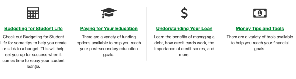
Screenshot: Canada’s National Student Loan Service Centre site doesn’t use any standalone CTAs in this screenshot since it’s clear that the titles are linked and the copy below provides enough context about where it leads.
Whether you write copy for a website or an app, CTAs play a crucial role in the user experience so it’s important to ensure each link is descriptive and clear. Consider these questions:
Clarify what will happen
Ensure that the text accurately conveys where the link will lead or what will happen when the action is taken. Consider the destination and see if you can include any relevant keywords that will help set some context. Always aim to give the users enough context so they feel comfortable and confident moving onto the next step.
Use plain language
Always choose the language that will be the clearest for the user. This means avoid branded language or corporate jargon. To find identify language that best resonates with your users, you may want to conduct content research and testing like card sorting and A/B tests.
Start with a verb
Always try to start with a verb as you want your users to take an action. For example “Explore ” or “Shop ”.
Include keywords
Incorporate the product or service name whenever you can, especially if you’re linking to the detailed product page.
Keep it short and succinct
While there is a time and place for your voice and tone to shine, CTA copy is usually not that moment. There’s generally not enough real estate to do that and set enough context for your user. Provide the context that you think is necessary in as few characters as possible to keep the button text on one line.
Consider all devices
Avoid writing CTAs that will only work for a certain device. For example, a CTA with the word “Click” doesn’t make sense for an app or those viewing on their mobile devices. Just as “tap” doesn’t work for those viewing on desktops.
 Screenshot: Both Squarespace (top) and Square (bottom) are good examples of sites that have crafted descriptive CTAs beautifully. They could have easily written “Learn more” for all three sections but instead, they wrote personalized CTAs with the context of where each link will lead, setting proper expectations.
We’ve established that standalone links like “learn more” and other non-descriptive CTAs don’t positively impact the user experience. However, there are a couple of cases where it could work.
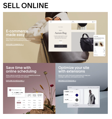
The first is expanding “learn more” to make it more descriptive. For example, “Learn more about ”. The CTA on Shopify’s website below illustrates how you can do this.
 However, this approach isn’t without its drawbacks. It’s fine for desktop views when you have more space but be mindful of this approach on mobile screens and in apps where you don’t have a lot of character space to work with. It’s also not optimal for SEO because you’re not front-loading relevant keywords.
Another scenario where non-descriptive links may work is if enough context is provided in the content right before the link. However, as mentioned earlier, this isn’t best practice for accessibility as it’s not easy for visually-impaired people to quickly glance back at the content before the link. You also run the risk of additional confusion if you mention more than one topic in the preceding paragraph. It could be misleading what the “learn more” is referring to.
So while there might be edge cases where you can use non-descriptive CTAs, it’s best practice and better for the overall experience to make all your CTAs as descriptive as possible.
Descriptive CTAs are more accessible, SEO-friendly, and compelling. They’re also better for navigation, scanability, and a mobile experience. Ensuring your CTA links are descriptive will always help you contribute to a better user experience at the end of the day.
Alice Chen is a Content Strategist at TELUS. You can connect with her on LinkedIn.
