
The way you write and display prices on an e-commerce site is more important than you may think. The way a price is written—its color, its placement in relation to the other elements of the interface—has a direct impact on the user experience and on sales. It comes down to a blend of UX writing and marketing.
We like to think that our decisions are rational and logical, but they’re not. Perception is a complex process that affects all areas of our life, including our purchases. Our decision to buy a product depends on many details that we’re not consciously aware of. A retail price seems more or less acceptable to us depending on many factors unrelated to the price itself.
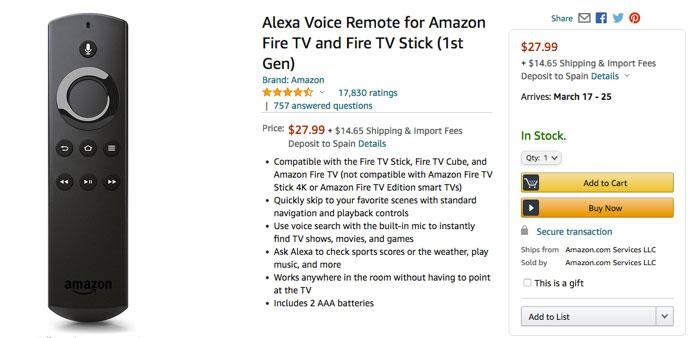
Amazon’s product page
As UX writers, our main concern is what and how we write. Should we write numbers placing commas every third digit? Should we write decimals even if the price is a whole number?
There’s a widespread marketing strategy that states that prices should include decimals and end in .99. The main reason why marketing says that $27.99 is better than $28 is that we, Western people, read from left to right. When we see at first glance 27 instead of 28, we think that the price is lower than it really is.
Between 27.99 and 28 is exactly the same difference as between 27.98 and 27.99. However, we perceive a higher difference in the first case, because the number on the left changes. The main reason may be how we read, but it’s not so simple. It also has to do with biases that cause us to ignore, without realizing it, the cents.
The main bias behind this quirk is the anchoring bias. The anchoring bias explains that we focus on the first information we receive. We anchor our attention on the number on the left, rather than on the full price. Nielsen Norman Group has a good article on anchoring bias in relation to user experience.
The .99 trick is part of what marketing calls psychological pricing. However, UX is not marketing. We have to remember that many traditional marketing tactics are based on contradictory historical research conducted before the digital era, or even on myths that have never been proven.
While it is true that sales tend to increase when you use the .99 strategy, you have to take into account other details. In 2012, the Journal of Consumer Psychology published a study entitled Comma N’ cents in pricing that advises against using decimals in prices. Their theory is that we perceive numbers with fewer syllables as lower. If we omit useless commas, users may be more tempted to buy a product that costs just $6 (six dollars) than one that costs $5.99 (five dollars and ninety-nine cents). As I like to remind myself from time to time: KISS (keep it simple, stupid).
Our brain processes simple things more easily, so it’s not surprising that keeping things simple affects also higher numbers. $6 seems less than $6.00 and $1649 seems less than $1,649. When we delete the comma, we are less aware that the figure exceeds one thousand dollars. I have not seen this on many websites, but in Europe, we have a well-known example from one of the largest consumer electronics retailers. This screenshot is from a Spanish website, but they use the same trick in Germany, Italy, and other countries.
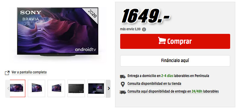
MediaMarkt’s product page
You may have noticed that this product page has another odd detail. The number is big and clear, but it does not include any currency sign. We assume, from the context, that the huge number is the price of the TV set, but there is nothing to indicate that 1649 is a price. Omitting the currency sign ($) and the name of the currency (Dollar) make us less aware that we are talking about money, and that pushes us to spend more money. I am not against all marketing strategies, but this particular one is problematic. Maybe you are not cheating the user, but you are being intentionally unclear. It’s cognitively ambiguous, so I would advise against it. We are UX writers, so clarity comes first and foremost.
If you work for a website or app that sells goods in several countries or languages, the issue with commas and periods in pricing becomes even more complex. Not all countries write numbers in the same way. In English, you would write 1,000 for one thousand and 1.00 for one dollar.
In most European languages, we use points and commas in the opposite way from English. That means that 1,000.00 in English translates into 1.000,00 in Spanish or French. It’s not a difficult change to understand and most language professionals are aware of it. But it can complicate design and development so be sure to plan for the differences.
In summary, how to write prices in e-commerce depends on several factors that may not always have the same answer:
If you’re not sure about something, you can always do some testing. UX is not an exact science; you need the feedback of your users. One last piece of advice about writing: always write the price. Never, under any circumstances, omit that information. Although in retail it is not usual to hide prices, it is a usual practice in B2B websites.
When we write for an interface, words are important, but we must also think about how they are placed in relation to the other elements of the interface. Let’s start with typography—the visual aspect more closely related to written language.
When you write a price using a small font, the price seems lower. This may sound a bit silly, but sometimes perception is as obvious and silly as that. Needless to say, you cannot use a 1px font, but the price will seem lower if you use 34px than if you use 55px. For more details, you can read studies such as Size Does Matter.
When we talk about font size, we have to talk about accessibility. In a website, all text should be 16px at least and 200% zoomable. You can use smaller sizes for minor details, but never less than 9px because that font size is no longer readable on some platforms. If you need more guidance about this topic, Font Size on the Web is a good place to start.
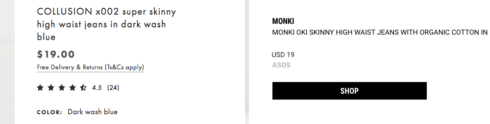
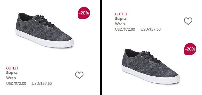
Asos (left) and Goxip (right)
These two jeans have the same price. However, the price on the left seems higher because the font is bigger. Notice also that Asos uses a bolder font and includes cents, while Goxip uses a regular font and a round figure. Those details also affect our perception. Goxip prices, as its name suggests, are engineered to seem cheaper.
Other visual perception issues are not so evident. We perceive prices as lower if they are placed to the left of the layout. When we see a number on a layout we tend to create an imaginary list of numbers in which the lower numbers are on the left and the higher numbers on the right. Note that some languages are not read from left to right, so this is not true for all users. Culture also affects our perception.
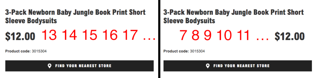
Primark’s product page (left), Primark’s modified product page (right)
On the left, you can see a real screenshot with the price on the left side. We see $12.00 as the lower number of an imaginary list. On the right, you can see a modified version that shows what happens when the price is to the right. I have not seen many e-commerce sites that use this second layout.
Another related issue is that we perceive a price differently if it is above or below the product’s image. As you can guess, we perceive the price as lower if it is below the image. If you want to know more about this specific phenomenon, you can read the research paper The Upside of Down.
Spartoo’s product page (left), Spartoo’s modified product page (right)
I’m sure that you haven’t seen many websites in which the price is above the product, instead of below. This may seem like something that designers decide by default because is what we are used to, but it is not just tradition. Good design decisions are never taken lightly.
In this last image, you can see the old price and the new sale price, something that is quite common in retail shops. Some years ago, a group of researchers published a study about how to show sale prices: The effects of physical distance between regular and sale prices on numerical difference perceptions. As you can see, everything has been researched.
They concluded that the distance between the old price and the new price affects our perception. When the prices are further apart, we think that the discount is bigger and we are more prone to buy the product. This is the reason why websites that do not offer big discounts tend to apply more distance between the old and the new price.
Casa del Libro’s product page
In sales prices, the size, the color, and the orientation of the text also influence our perception. On Amazon, the sale price is below the old price, while on H&M is to the left. The position is different, but the strategy is the same. As I have already explained, both tricks help to push us to perceive the sale figure as lower.
Amazon’s product page (left) and H&M’s product page (right)
Both websites use red to highlight the sale because it is a striking color that captures our attention. The most appropriate color for a price depends on several factors, such as the type of product and consumer. A good reference on this topic is How Do Colors Affect User Choices and Purchases?
Note that most of these studies are from the USA. Biases are often shared and most Western people have similar perception patterns, but something that is true for Americans may not be true for Spaniards or Germans. Color perception varies depending on the country in which you grew up. In Ireland, for example, green has connotations that it does not have in Japan or Canada.
In any case, from the UX point of view, the most important thing in terms of color is not the color itself, but the contrast. Whatever color you choose for your price, make sure that the contrast between the number and the background is good. You can verify this easily using a contrast checker.
E-commerce is about selling. Usually, products are not free—at least not physical products. However, many sites offer free digital products, such as e-books, to attract attention or gather personal data.
In my country, Spain, this free product strategy is also used by many cell phone companies. They offer you a free cell phone in exchange for a long-term contract. I don’t know if this is common in other countries, but here it’s been a thing for quite a few years.
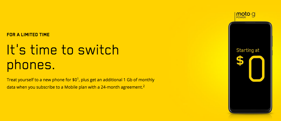
Videotron’s home page
If you want to offer freebies, research shows that “$0” is better than “free”—Is $0 Better than Free? Using the number focuses our attention on the saving. In any case, from the point of view of UX, we could argue that we are not saving anything. Maybe we are not wasting our money, but we are giving away data, or allowing an abusive contract in the case of cell phone companies.
Finally, I would like to add a note on accessibility. It is important to remember that there are disorders that affect arithmetic skills, such as dyscalculia. If you care about your users, you should follow the recommendations of a style guide for dyslexia. Most of them are basic recommendations that will help every one of us, such as using legible fonts and good contrast.
As UX writers, never forget that ethics should be one of our main concerns. If you cheat your user or use abusive practices, you could lose trust and lose them forever. You can optimize prices to make them clearer or more attractive, but don’t rely on confusing or misleading tactics.
This post was originally published in Spanish and translated to English for UX Writers Collective readers. Connect on LinkedIn!
