
What’s growth content design?
Growth content design is the practice of writing content for product adoption and usage. It prioritizes data, experimentation, and rapid iteration.
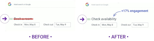
For example, Google used 18 characters to lift engagement by 17%:
When Google changed “book a room” to “check availability”, engagement increased by 17% on their hotel search product.
How is it that language made such a significant impact in this experience? To answer this question, we need to understand the core considerations and tools of content design for growth. For now, let’s work backward to a simple hypothesis: “Book room” has a higher emotional charge because it requires higher commitment than “Check availability”.
Let’s focus on honing your ability to arrive at this type of consideration yourself and then carry it forward into your own content efforts.
We’ll cover:
- Core principles including the Fogg Behavior Model
- Frameworks on perceived value and information foraging
- Craft-level tools for writing growth content
Core principles
Let’s explore some of the core principles that come into play when designing content for growth. First up, we’ve got the Fogg Behavior Model.
Using content to prompt target behaviors
Behavior =
Motivation – The willpower to take action
Ability – The capacity to take action
Prompt – The push to make it happen
This model provides a solid foundation for growth content design because of how each of the elements in the equation can relate to language.
The model holds that users will perform a target behavior when there’s adequate motivation and ability for a prompt to succeed.
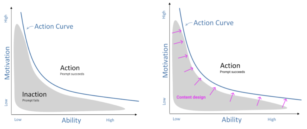
The higher the motivation and the higher the ability, the more likely it is that a prompt will succeed.
Content designers are often responsible for writing language that will push or propel people through that action curve. Whether that’s through clear tooltips, efficient error messages, actionable empty states, or whatever else we can get our words into, we writers have a lot of power when it comes to growth levers.
While it’s alright for users to learn a product at their own speed, they should never be left hanging in an inactive state. In addition to contributing to product abandonment, these states represent an opportunity for competitors to slip in and motivate folks in their direction.
Focusing on content levers, not holistic experiences
One of the big differences between designing content for growth and content for general product experiences is that growth content designers will get laser-focused on finding and pulling levers for growth.
This means that a growth content designer will optimize for action within a single sign-up screen by experimenting with two or three of the screen’s content elements rather than by improving the entire experience of sign-up content across every user touchpoint.
But just because growth efforts are often focused on business goals doesn’t mean that content designers need to use deceptive language or dark content patterns.
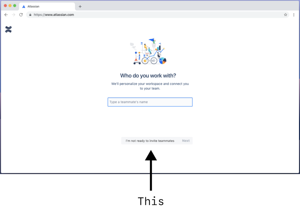
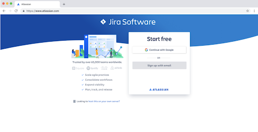
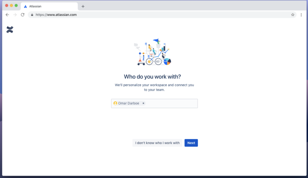
Here’s an example from a team setup flow at Atlassian.
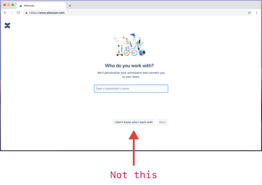
“I don’t know who I work with” might seem like a clever nudge away from a secondary CTA that doesn’t drive business goals, but it’s confusing and it contributed to a 19% abandonment rate in this sign-up experiment.
As demonstrated in the sign-up experiment button copy above, the best growth content will make products more accessible for everyone.
Here’s another example from a recent growth experiment at Atlassian.
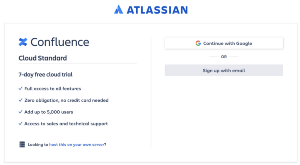
Control: We identified an opportunity to increase signup rates for a free trial of our Confluence Standard plan, which is one tier above our Free plan.
Experiment: We focused on social proof and value-enhancing use cases. Notice how we didn’t change the button copy 😉
These examples demonstrate the narrow focus of a growth content designer. And it’s worth noting that they’re intentional restrictions. In order to meet our business goals, and prove content impact, our design work often sits just outside the rest of a product’s content design efforts.
Frameworks
Now that we’ve explored some of the core principles of content design for growth, let’s review two frameworks that can help us map our content to this foundation: value perception and information foraging.
Influencing perceived value
Before someone can read words on a page, they’ll arrive at a perceived value by scanning the content’s structure.
So no matter how much a designer thinks about principles like the Fogg Behavior Model, the content will fail if it’s not delivered effectively.
And it’ll fail right away. Why? Because people determine the perceived value at a glance.
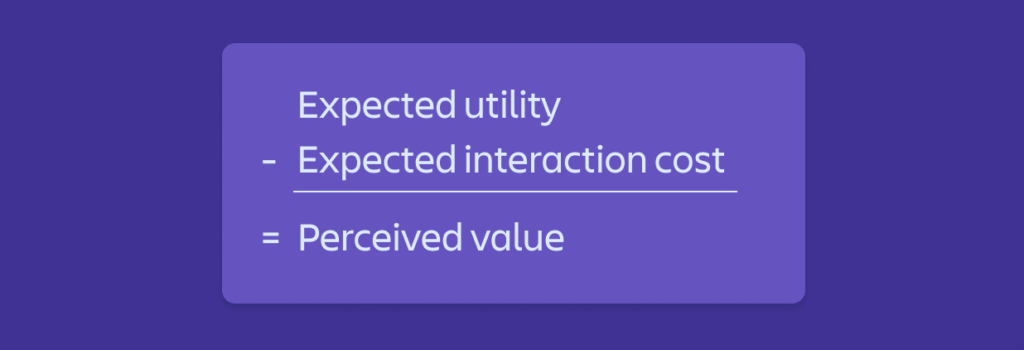
The perceived value formula holds that the perceived value of an experience is equal to the experience’s expected utility minus its expected interaction cost.
Is this true? Well, consider this storefront:
What’s the perceived value here?

And how about this storefront:

How is the perceived value different?
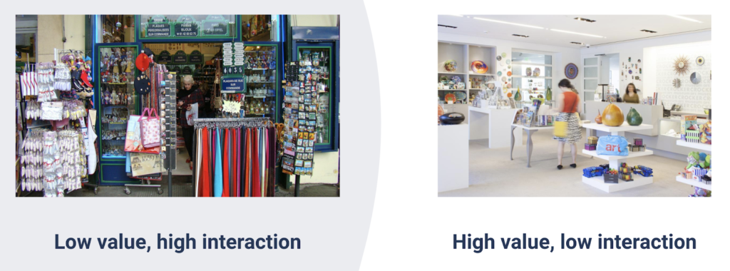
In this analogy, the expected utility of the souvenir shop and the museum shop is more or less equal. But the souvenir shop requires a higher interaction cost to find what you’re looking for. This interaction cost results in a slightly lower perceived value. The museum shop has a curated, sparse selection of items, contributing to a higher perceived value.
Before we even read something, we establish a perceived value based on signals that tell us what the interaction cost vs. expected utility might be.

Helping people forage for information
Content is information, and people who use digital products spend a lot of time foraging for information. It’s how they learn to use products, build habits, and share their experiences with others.
The information foraging theory is helpful for thinking about this type of behavior.
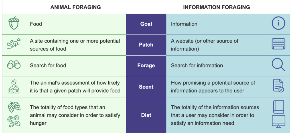
A person’s success in finding and consuming the information they need depends on how we design the content within our products. In the language of information foraging, we might say that their success depends on how well we design our informational patches.
Logical foraging
Sometimes, people will intentionally engage with or seek out information in order to learn a new product or feature. This type of information foraging provides a straight-forward yet narrow path for content design.
Common types of information patches here might include a tutorial modal, a series of linear tool tips, or a helpful one-off email.
Emotional foraging
Often, a person will determine the value of an experience or product based on how information was delivered over multiple types of media and experiences throughout an undefined period of time.
For instance, a large team’s administrator who is evaluating an enterprise plan during a free trial will be in a constant state of information foraging without even realizing it.
These types of information patches are complex and require a more robust and nuanced strategy.
Craft
Now we can begin to review craft-level considerations. These will help us put pen to paper (or fingers to keys) in our attempt to create growth-centric content. At the writing stage of content design, any core strategy or framework considerations should be running in the background of your mind or documented somewhere for reference.
Writing for readability
Readability describes the ease with which someone can understand a piece of text. And the connection between growth and readable content is strong.
Effective growth content is easily understood by the largest audience possible.
Let’s pull back the content curtain on one of Webflow’s onboarding modals.
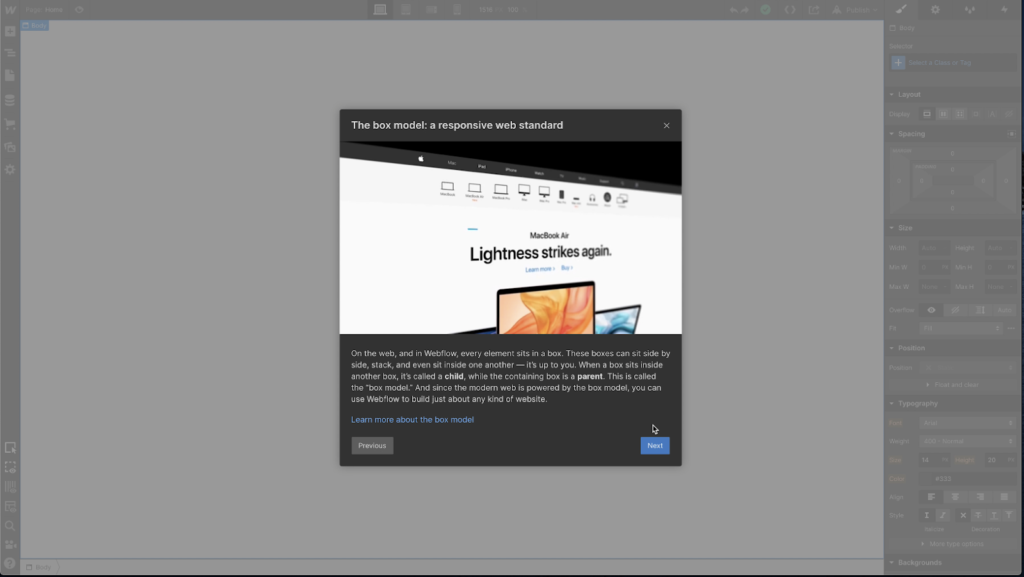
Flesch-Kincaid grade level: 5.6
Reading time: 21 seconds
Words: 82
This modal’s grade level of 5.6 is excellent. It adheres to the National Assessment of Adult Literacy, which holds that text for the general public should be written at or below the 8th-grade reading level.
But readability isn’t the only barometer to keep in mind while designing readable growth content. My intuition as a writer tells me that the modal’s estimated reading time of 21 seconds is potentially too long.
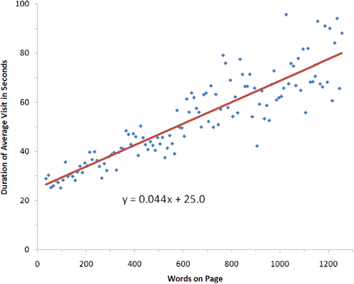
The data on this scatter plot from NN/g indicates that at 82 words long, users would spend, on average, about 25 seconds on the screen. But there are two considerations to keep in mind with this data:
- In a modal tour, the length of content will be compounded by the anticipation of future screens.
- Content length may be exaggerated when experienced within the context of a larger interface (like a modal within a dashboard).
Readability is about more than comprehension
When we design content for readability, we make it easier for all users to take action, and that’s what growth is all about.
According to Content Design London’s guidelines, readability addresses:
- Time pressures – Simple content is easier to scan and absorb
- Stress – When anxious, it’s harder to absorb complex language
- Multi-tasking – With divided attention, users require simple information
- Low-literacy – Complex vocabulary and terms may not be known
- Cognitive impairments – Simple language takes less cognitive load
- Motor-impairments – Clear, concise content needs less navigation
- Non-fluency – Accommodating for users whose vocabulary is less extensive
- Sight loss – RNIB recommends using plain English
- Autism – National Autistic Society advise against the use of jargon
- First language sign language – Vocabulary may be less familiar
Writing for emotion
If we’re trying to adhere to the B=MAP model, then our style of writing should acknowledge emotion. Language with a negative emotional charge can drive down motivation and ability. Plus, emotional qualities are difficult to pin down.
Let’s return to the “I don’t know who I work with” CTA, which may inadvertently contribute to the perception of a negative experience:
A hunch tells me that asking users to self-select as either someone who knows their teammates or someone who doesn’t create a negative emotional experience.
Categories as emotional guardrails
It’s easy enough to look back at a piece of language and see that it accidentally carried some negative emotion. But the process of writing becomes much more complex when you sit down with the intention to write for emotions.
One way to target positive or neutral emotions in writing is to apply broad categories of emotional responses to growth content.
In Nir Eyal’s book Hooked: How to build habit-forming products, he describes the process of targeting emotionally rewarding reactions. He identifies these as variable rewards and places them in three categories:
- Rewards of the tribe – Rewards that make us feel accepted, important, attractive, and included.
- Rewards of the hunt – Rewards that make us feel like we’ve earned something and keep us hunting for the next discovery.
- Rewards of the self – Rewards that prompt personal gratification.
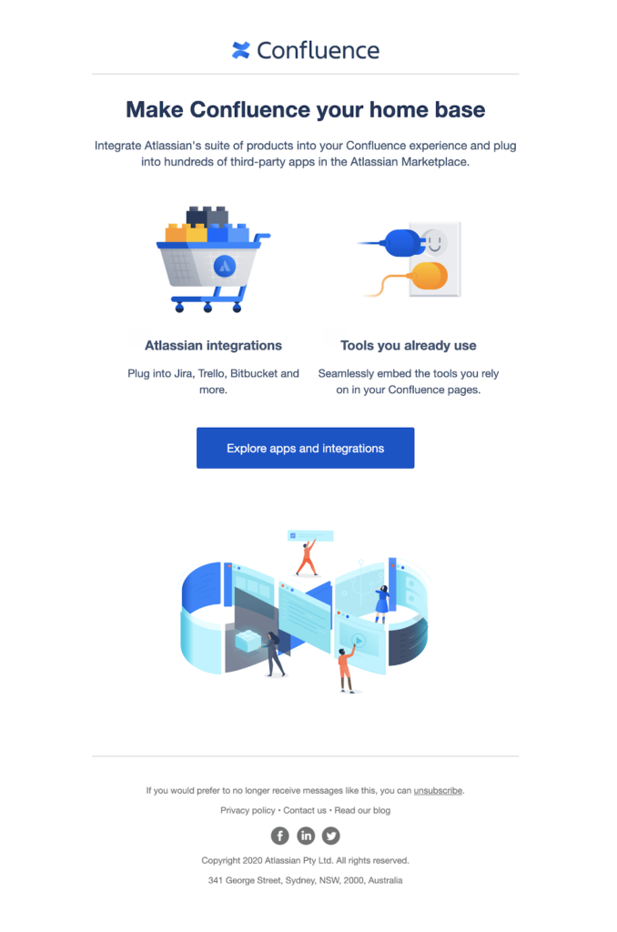
Here are some examples of how I tried to apply these categories to a series of Confluence onboarding emails at Atlassian.
Rewards of the tribe: Feeling accepted and important.
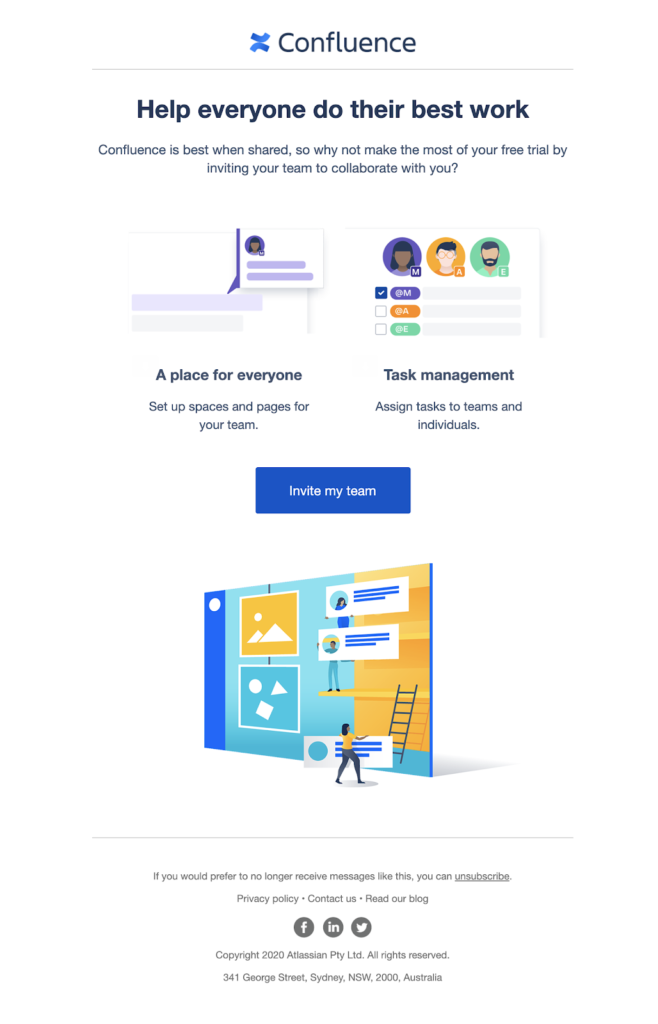
Rewards of the hunt: The ability to share the efforts of your hunt.
![]()
Rewards of the self: Mastery of the world around us.
While these three categories don’t target the entire range of human emotion, they can help to keep our growth content within the confines of positive or neutral language.
Use these categories as an early warning indicator. If a piece of language doesn’t fit within one of the rewards of the tribe, hunt, or self, it might be worth taking a closer look before it gets deployed.
Back to Google
Let’s return to the Google experiment from the top of the article.
With a more substantial understanding of content design for growth, we can now add some meaningful detail to our hypothesis.
Let’s revisit B=MAP (Behavior = Motivation, Ability, Prompt).
In addition to our assumption that “Book room” holds a higher emotional charge than “Check availability”, we can add that this emotional charge will drive down motivation, making it much more difficult to prompt our target behavior.
And that is the type of consideration that growth content designers will look for when identifying growth opportunities.
Jason Fox is a senior content designer at Atlassian. You can connect with him on LinkedIn.
Did you enjoy this blog post? Level up your skills and knowledge in one of our courses. Your career is depending on you!
